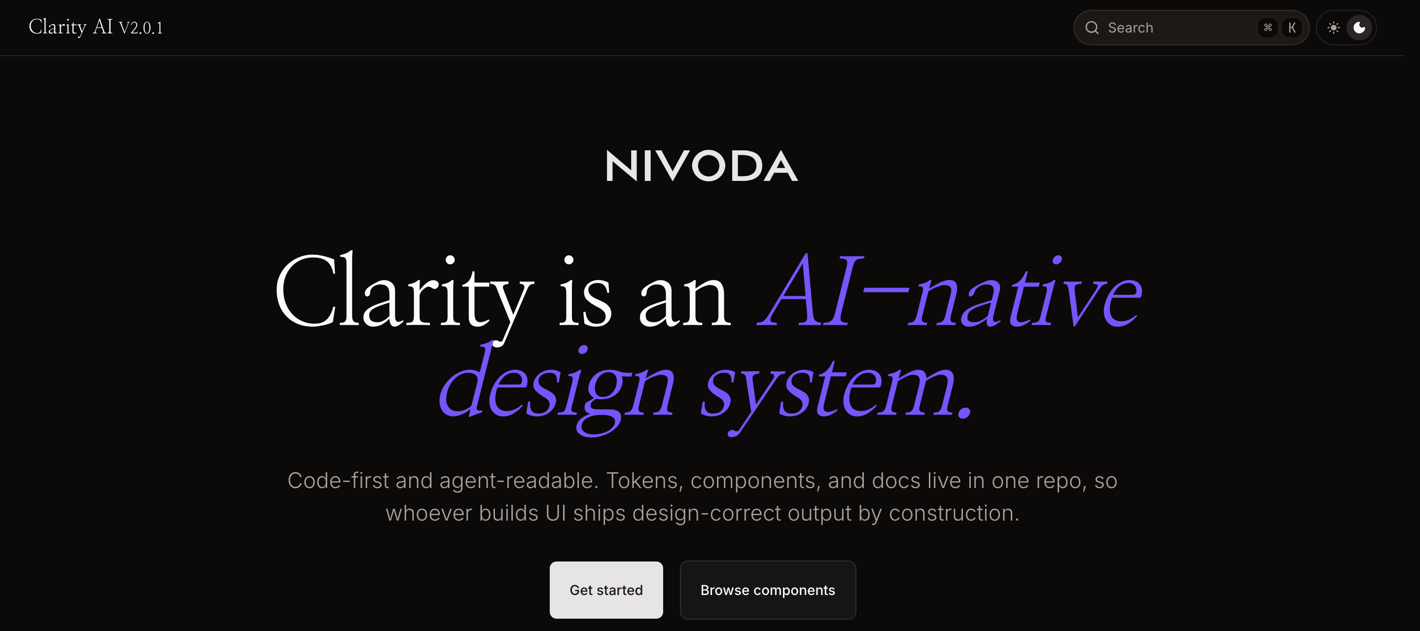
Clarity
A code-first, AI-native design system that makes wrong UI impossible — built, documented, and running in production.
- My role
- Design systems lead — owned strategy, token architecture, component API design, build tooling, governance, and docs
- Context
- A global B2B jewellery marketplace (anonymized)
- Duration
- ~3 months, foundations to ~63 components
- Stack
- W3C DTCG tokens (OKLCH) · shadcn/ui + Radix · Tailwind v4 · Nx monorepo · Fumadocs · Storybook
- What shipped
- Token pipeline · component library · live validation app · agent-readable docs · governance model · 4 ADRs
The problem
A system that suggested, but didn't enforce
The client had a working design system — Material UI, a hand-rolled token pipeline, 60+ components. On paper, fine. In practice, it leaked design intent at every seam:
sx={} escapes — each a place a token could be ignoredThe team was paying, continuously, to make a Material system not look like Material. Responsiveness was opt-in, bolted on per component rather than encoded in the contract. And the cost showed up as a loop that dominates UI delivery almost everywhere:
The thesis
The components are the design
Not "the components follow the design." The components encode it — tokens, spacing, type, accessibility, responsiveness, and the legal range of variants — inside the API. The guard-rails live in the prop signatures, not in a Figma file or a reviewer's eye.
The consequence is the whole point: there is no path by which an engineer builds something "correctly" that is also "design-incorrect." Design stops reviewing implementations because there's nothing left to catch. The QA loop doesn't get faster — it gets deleted.
A second thesis followed from where the industry is going: if the components are the source of truth, that source should be legible to machines, not just people. Engineers, designers, and PMs increasingly build through AI coding agents. They should all consume the same library and inherit the same guarantee — so the system was designed AI-native from the foundation. The repo itself is the API; the documentation is the interface an agent reads.
How I approached it
Four phases, foundations to library
1 · Diagnose before building
I didn't start with components. I started with a forensic audit of the existing system, because the fastest way to lose a design-system rebuild is to recreate the old one with nicer syntax. The audit produced the numbers above and — critically — a token-by-token comparison against what was actually shipping in production.
That de-risked everything downstream: I made 15 explicit token-alignment decisions so the new system's values matched production. Migration could then happen incrementally with zero visual drift.
2 · Tokens as the contract
- Source of truth: W3C DTCG JSON in Git — vendor-neutral, spec-backed, future-proof against Figma's native token import.
- Two tiers, deliberately: primitives (raw OKLCH, e.g.
color.azure.500) and semantic role tokens (action.primary,feedback.error). Component values live in variants, not a third tier — which kept the governance surface small. - OKLCH colour for perceptually-even ramps and predictable dark mode.
- One source, every platform: compiles to web CSS, a shadcn theme, JS/TS for React Native, inline email values, and backend JSON. Semantic tokens emit
var(--…)chains, so a primitive can be retargeted without recompiling consumers.
color-feedback-error, never blue-5) are the single highest-leverage thing you can do — for human clarity and for AI output quality.3 · Components on headless primitives
The library is built the way the best teams build in 2026 — Radix headless primitives + Tailwind + code-ownership (shadcn distribution), the same foundation OpenAI, Vercel, Linear, and Supabase run in production. No design language is inherited from a vendor; nothing has to be overridden back out.
Scope reached ~63 components across four atomic tiers — 38 atoms, 16 molecules, organisms (FilterToolbar, Megamenu, Sidebar) and page templates. I hardened one reference component (Button) to define what "finished" means, so the rest of the library had a quality bar to seed against and harden through real use. Crucially, the library was validated against a live test application wired to real data — a component isn't done because it renders in isolation; it's done when it survives a real product surface.
4 · Documentation that is the interface
- A top-level library map — a for/not-for index of every component, designed to be the first thing an agent reads.
- 63 colocated docs — props, usage, do/don't — living next to the code so they never drift.
- TypeScript contracts as the spec, Storybook stories as executable examples, the Nx graph as machine-readable structure.
Because the docs are the repo, an AI agent always reads the current truth. No sync step, no stale mirror.
Judgment
Decisions, recorded as ADRs
A design system is mostly a series of "do we adopt this tool?" calls. I recorded four — the reasoning is the artifact, not the choice:
- Bespoke token build over Style Dictionary — adopt vendor tooling until it costs more than it saves; then own a small, tested script. Reversible: the DTCG source never changed.
- Removed visual-regression testing — right tool, wrong time. With one finished component and no CI, it was pure overhead (and a live secret-exposure risk). Re-evaluate at 10+ components.
- Rejected Figma↔code token sync — bidirectional sync solves a problem this team didn't have. Designers explore in Figma; they don't author tokens there.
- Markdown docs over a hosted hub — when the source is already agent-readable, the docs site should read it directly rather than maintain a polished copy.
How I worked
What a system like this lives or dies on
Beyond the code, the things that decide whether a design system survives:
- End-to-end ownership. I led this from strategy through token architecture, component APIs, the build pipeline, governance, and docs — not a slice handed off, but the whole spine.
- Designed for the handover, not for me. Two token tiers, a tested ~230-line build a non-engineer can read, decisions captured as ADRs, docs that live in the repo. The point was a system the team could own and extend after I stepped out — not a black box only I understand.
- De-risked the politics, not just the code. Pre-aligning tokens to production values meant migration was invisible to users and uncontroversial to leadership — adoption didn't need a flag day or a re-skin everyone would argue about.
- Set the quality bar by example. One reference component, fully finished, defined "done" for everyone (and every agent) that came after it.
- Worked with how designers actually work. Designers explore in Figma; I made the code the source of truth without forcing them to author tokens in a tool they don't live in.
Outcomes
What changed
- The QA loop is structurally gone, not optimized. Engineers import components that are the design; design has nothing to catch.
- Design hours redirected from reviewing implementations to building components, documentation, and governance.
- Zero-drift migration path — new values pre-aligned to production, so adoption is incremental and invisible to users.
- Self-service for non-engineers — designers and PMs build correct UI directly through AI agents, against the same library, with the same guarantee.
- A clean, reviewable Git history — phased, conventionally-committed, decisions recorded. Auditable, not a black box.
- A small, ownable governance surface — two token tiers and component-encoded variants instead of 32 token files and 81 override sheets.
If you can build it, it's already design-correct.
Stack at a glance